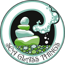
I am in need of more business cards and found another great source on Etsy as my original isn't available and I really, really need them. I really love my old ones - however, I told him I was willing to look at what he had in mind. I have a few minor text edits to be made on the new one - basically wording.
What do you all think?
OLD:
What do you all think?
OLD:

NEW:
Thank you to all who chimmed in! I have decided to go with the new one to see how it works - however, I am also going to be re-ordering my old ones later in the month because I just love them! So - below is the new one with a minor logo change and the word "Decor" will be added to the bottom as well!


9 comments:
oohhh I love the colour of the new one!
Thank you sooo much for your imput Sherry - so far the new one is in the lead!
Marla, I can't quite put my finger on it but I am more drawn to the first one! I think it is because of your logo. It compliments the logo and allows other colors in you logo to stand out where as the blue kind of makes the entire logo all blue? Does that make sense? The green background seems to make your logo pop! :0)
Jodie
Hi Marla! I actually like the newer one, I think the blue make the logo really stand out more, and is crisper.
-Jen Tang from
www.majentadesigns.etsy.com
I love the blue one. I think it's soothing and it gives the feel fo the sea. Plus I love that the words are sort of glowing because it's like finding treasure in the sea. . .
Hi Marla. While the colors in the new logo are definitely more sea-like, to me the wording is harder to read, and competes for the attention of the logo because of the amount of white. I think the logo stood out more in the older one. Just my 2 cents :-)
hey marla i like the old one better but sometimes you do just need a change!
The newer one is definitely the way to go-more "seaish!" Very pretty, too. Like the word, "Decor" also.
Good work!
Corporate Logo Designers www.rimis.net
Post a Comment